In his
Career he published several books on creative thinking. He published a book in
1942 named How to Think Up and this
is where he came up with the idea of brainstorming.
In 1954 he created the Creative Education Foundation, which were sustained by
the royalties which were earned from his books. Along with Sidney Parnes, he developed the
"Osborn-Parnes Creative Problem Solving Process". He co-founded the
Creative Education Foundation's Creative Problem Solving Institute, the world's
longest-running international creativity conference.
Sidney Parnes/Alex Obsorn
Creative Thinking
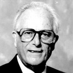
Sidney
Parnes was born on the 5th of January 1922 and died August 22nd
2013. He was renowned as an expert on creativity and the founder of the
creative studies program at the SUNY Buffalo state.
Sid Parnes
had partnered with his advertising executive Alex Osborn in the 1950s which
then they went to create the Osborn-Parnes creative problem solving process
which were based on Osborn’s brainstorming techniques and began to organise a method
for teaching it. Parnes, an Army Veteran from World War 2, he had earned his master’s
degree from the University of Pittsburgh in 1953 and then completed his
Doctorate in the following year. He first met Osborn at the Creative Problem
solving institute conference and he then used that as a creative retailing
conference at the University of Pittsburgh where Osborn then recruited him to
help develop his ideas.
In 1956,
Parnes joined the faculty at the University of Buffalo, which offered a course
in creativity, as a professor of retailing. In 1967, he went to Buffalo State
to start a pilot program in creativity and became the founding director of the
International Centre for Studies in Creativity. He became president of the
Creative Education Foundation in 1967 after the death of Osborn and served
until 1984, then was chairman of its board of trustees. He continued to serve
as a lifetime trustee. He also became director of the Creative Problem Solving
Institute, which was held annually at Buffalo State from 1966 to 1984. He published
more than a dozen books on creativity, notably the influential “Creative Behaviour
Guidebook” in 1967, and hundreds of articles. He spoke at conferences,
workshops and seminars around the world and received numerous awards, including
a Lifetime Achievement Award from the Innovation Network.
Alex Osborn
 Osborn was
born on May 24th 1888 and died May 5th in 1966. He was an
advertising executive and the author of the creativity technique known to us
all as Brainstorming. He was born in Bronx and spent his childhood in New York;
He was a graduate of Hamilton College, where he had worked for the school
newspaper.
Osborn was
born on May 24th 1888 and died May 5th in 1966. He was an
advertising executive and the author of the creativity technique known to us
all as Brainstorming. He was born in Bronx and spent his childhood in New York;
He was a graduate of Hamilton College, where he had worked for the school
newspaper.